This meant there was quite a bit of trial and error involved until I got the correct result (more on that in a future post). To check I where things were going wrong, I had the code output the calculated galactic coordinates (latitude and longitude across the sky, measured from the galactic centre, as well as velocity along the line of sight), with the data set to zero inside the solar circle where the solutions would be garbage. Actually I'm pretty sure I got the position of the solar circle wrong, so this is just a complete mistake.
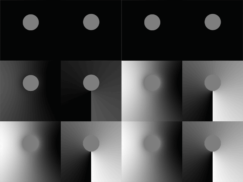
But it did produce a couple of fun little optical illusions :
 |
| Raw image here. |
Both are quite similar. The colour in the grey circle looks like its varies, but it doesn't : it's completely uniform.
The effect is strongest with the left figure, which is velocity. The right side of the circle appears significantly brighter and the left significantly darker, a bit like looking at a crater in partial shadow (or, if you take the inverse perspective, a dome). Cover everything except the circle with your hands and you'll see this is entirely the result of your brain inventing stuff.
The figure on the right (galactic longitude) can be subtle at first, but once you see it, it's very hard indeed to make it stop. This time the right side of the circle appears darker and the left brighter, especially when you focus on the edges. I find that I can more-or-less control how strong this appears by concentrating on different parts of the circle, but sometimes it becomes so strong that I can barely make it stop even by covering the edges.
If we apply an animated mask to the regions outside the circles then things get even more fun (apologies for the small radial artifacts caused by gif compression) :
 |
| Raw image here. |

No comments:
Post a Comment