Sister blog of Physicists of the Caribbean. Shorter, more focused posts specialising in astronomy and data visualisation.

Friday 22 February 2019

Visualising isosurfaces in Blender for funzies

Most of the astronomy data sets I work with are three dimensional. Sometimes I use numerical simulations where we have all three spatial dimensions, but most of the time I use radio telescope data where the third axis is velocity. That doesn't mean it isn't useful to visualise in 3D though, as long as we're careful not to confuse it with true distance.

Finding ways to visualise the full volumetric data has been a long-term project of mine. It's relatively easy to show small parts of the data, but showing hundreds of millions of voxels is more of a challenge. Especially if you want to do it in realtime. I found a way to do this ages ago and have been banging on about it ever since.


Various techniques for displaying more limited aspects of the data have been around for even longer. For example, you could clip all the pixels above and below some brightness level and greatly reduce the amount of data you need to display. While useful for analysis, this has always worried me in terms of the discovery side of things : if you want to find what's in your data, ideally you don't want to chuck any of it away.The problem is that you've got to display things in a sensible way, or the fact that something is present doesn't mean it will be visible. The more data you have to display, the harder this is. And as I've been discovering recently, sometimes the best way to find new sources is through good old-fashioned (3D) contour plots.

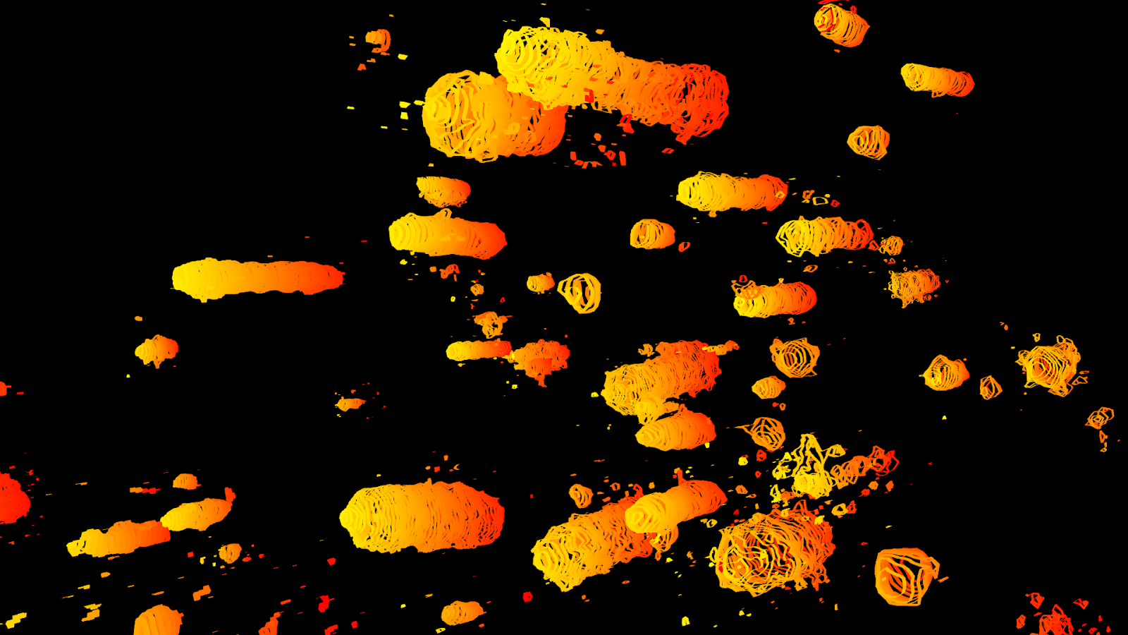
Part of a hydrogen data cube from the Virgo cluster. Each stringy blob is a galaxy, with each contour being at the same brightness level but in different slices of the data.
What we see is that in some sources all the contours are circular, but in others some contours have little extensions. Because these tend to be very faint, these tend to be much harder to spot in the full volumetric data, so this is a great way to spot things we couldn't see otherwise - the extensions stand out very clearly in contour plots.

But these simple contours are crude. As you can see by the stringy appearance above, they plot each slice of the data independently. It's like the sort of 3D models you might make in school : kinda cool if they're done well, but not really ideal. It would definitely be preferable to plot true isosurfaces of constant brightness levels, which would smooth everything out.


That's what I've been experimenting with today. Plotting contours is relatively easy - I just use the standard matplotlib package to generate the lines, then extract this into Blender* and extrude them to create the thickened lines you see above. Interpolating the missing data in between each slice, though... to fill in the missing slopes, that seems much harder.

* Saving the plots in postscript file, which saves the positions of each vertex in convenient ASCII format.

There is in fact code for Blender to convert point clouds into surfaces, which I tried a while back but couldn't get nice results. I've finally figured out what I was doing wrong. First, the object scale needs to be applied, otherwise the skinning distance becomes meaningless. Second, the points need to be evenly sampled and reasonably dense, otherwise the poor thing can't work out how to join them up. The main problem for my the data was that it varies strongly from slice to slice (channel to channel for radio enthusiasts), leaving huge gaps in the resulting meshes. I found I could sometimes get around this by scaling down the mesh in the z-axis in edit mode, but this only helped a little. A better method was to interpolate extra channels so the data is sampled at more points, making it easier for the script to fit a true surface.

The first data set I tried this on was of a complex of HI clouds we're currently studying in Virgo, and I'd rather wait until the paper is submitted before showing that. The second one I tried was the older data of M33. This is a huge, very bright source so you see lots of different structures at different intensity levels, making it an ideal test for nested isosurfaces.

Full volumetric data. M33 is in the centre. The other stuff you can see around it is emission from the Milky Way.
Rendering the contours as thin lines shows a lot more of the detail, and also makes it easier to cut out the foreground Milky Way clouds. Here the contours are all at the same flux value, with each one at a different velocity channel.
Joining the contours forms a true isosurface. There are quite a few artifacts, however, as Blender isn't able to work out the normal directions for all the faces correctly.
Finally, we can do the same at a series of different intensity levels and make the isosurfaces transparent to show the full range of the different structures.
This is still at proof-of-concept stage. I had to modify the original code to only plot line contours rather than the surface meshes, manually run the interpolation code and scale down the meshes to get everything to work. So there's currently far too much manual intervention to use this for any kind of analysis, and the meshes aren't all that clean either. Getting this into a scientifically useful product will take a lot more work, but it's fun to play with and certainly presentation-worthy if not science ready. What might be especially fun for outreach is to upload the models for online viewing, which is MUCH easier for surfaces than for volumetric data.


EDIT : Now uploaded as an interactive Sketchfab model !

Friday 15 February 2019

AGES : The End Of The Beginning

Early this morning I received an e-mail from Robert Minchin :
Dear Hector,
The observations on the morning of 15 February successfully completed the Abell 1367 field, concluding project a2048 which began on 21 December 2005. Thank you for the 2739.5 hours of observing you have scheduled for us on this project!

That's right : after more than 2700 hours of observations with Arecibo, spread over more then 13 years, the Arecibo Galaxy Environment Survey is now complete. The precursor observations started even further back, in 2004. I joined up as a fresh-faced PhD student in 2006 and it's been the core of my research ever since.

From the project website :
The Arecibo Galaxy Environment Survey (normally known as AGES) is using the Arecibo Telescope to search for galaxies in a number of quite different areas of the local universe. These vary form the Virgo Cluster, where there are huge numbers of galaxies very close together, to the Local Void, a region where the few galaxies to be found are very spread out. How many galaxies are in a region, and how close together they are, affects the way galaxies develop; but we are also finding other differences between the different areas that are left over from the time galaxies were first forming. By investigating these differences we are finding out more about how galaxies formed and how they are still developing today.
AGES uses the awesome power of the massive 305m Arecibo dish to search for neutral hydrogen. Its unique feature is its sensitivity over a large area. Only a handful of other surveys can claim higher sensitivity levels, and they're all over much smaller areas of the sky. AGES has survived management changes, bizarre management, good management, bad management,flooding, hurricanes, students, and yet more managerial crises.

What have we got to show for all this ? Ten direct papers plus numerous spin-offs, including such highlights as :

- Keenan's Ring, a ring of hydrogen larger than the full Moon sitting right next door to M33 that no-one knew about before we came along. How did it get there ? We have no idea !


- The largest streams of neutral hydrogen known so far !

- A lonely smurf


- Dark galaxy candidates !


- Doodles and poetry !


- User non-hostile software explained by a magical moose !


And lots more. There at at least 1,000 unpublished detections in need of analysis and publication. I can only give you some hints as to what awaits us... Re-analysing my very first data sets with new visualisation tools found long hydrogen streams we'd previously missed (paper submitted), so even the oldest archival data may yet hold more discoveries. We've also found several ultra-diffuse galaxies which are gas-rich, which we did follow-up molecular gas observations using the IRAM 30 m telescope in Spain. How many more of these weird objects could be lurking in the archives ? We only have 3 really unambiguous targets, but we estimate there could be as many as hundred just waiting for someone to accurately classify them. And we have a survey region of the Leo Ring which is guaranteed to be interesting, our successor survey WAVES is already delivering some very interesting results (first paper submitted), and other fields where we just don't know what we might find.

The data collection is complete. The science will continue, very much literally, for years to come.

Sunday 10 February 2019

Welcome to Little Physicists !

Greetings ! Some of you may be familiar with my first blog, Physicists of the Caribbean. If so you might be wondering why I'm starting a second. Well, I shall tell you.

For those of you not aware, PotC is a blog about everything. It started off as abject silliness, and fortunately it still contains no small amount of that. But over the years it's been getting more and more sciency, and the posts have been getting longer almost to the point of absurdity. At the same time, I've hitherto been active on Google Plus, which was a fantastic place to write much shorter pieces aimed at a scientifically enthusiastic but largely non-professional audience.

As the tragic shutdown of Google Plus approaches, I've begun the process of archiving the more interesting content I had there. In particular I had several astronomy-related threads in which I wrote short commentary and description of the latest astronomical papers - usually ones which don't make the headlines, and sometimes those that people expressly ask me to write about.

This blog is an attempt to preserve all that before it vanishes into the ether. PotC isn't going anywhere, and longer analyses will stay there (though I'm trying hard to reduce the length as much as possible). Little Physicists is an attempt at a much more focused blog about astronomy and the life of an astronomer. The main focus is on translating scientific papers into something more accessible to the general audience. Unlike PotC posts though, which are intended to be standalone, these ones often assume a small amount of background knowledge. I won't be trying to summarise every term or link to explanations of absolutely everything. This makes the posts much shorter and easier to write. Of course if you have any questions, just ask in the comments section.

Little Physicists is still a work in progress. Several posts are currently placeholders which will be updated as soon as possible. Right now it includes my commentary on papers and data visualisation experiments but little else. Over the coming days and weeks, I'll also be importing posts about observing trips and maybe some selected philosophical posts too, where they directly relate to astronomy. Again, the full, finished products can be found over at PotC or my website or YouTube channel, while this blog is a better place to find small, in-progress tests.

In the near future I'll also be starting a third blog, using all my non-sciency (mostly political and philosophical) Google Plus posts as a core. My hope is that by this new strategy of shorter posts in much more focused environments, it'll be easier to reach a more interested audience, make cross-posting much simpler, and give greater long-term security. More science, more win !

Back from the grave ?

I'd thought that the controversy over NGC 1052-DF2 and DF4 was at least partly settled by now, but this paper would have you believe ot...