The current paper I'm working on involves a rather obscure procedure for cleaning radio data. As usual I'm dealing with an HI data cube that consists of multiple velocity channels. Each channel maps the same part of the sky at 21 cm wavelength at very slightly different frequencies. The exact frequency gives us the precise velocity of the galaxies, letting us estimate their distance and measure their rotation speed.
How you go about displaying all these channels in a paper depends on what you want to show. For what I'm working on, the best approach is to sum them all up, "stacking" the data to create a single 2D image.

That's obviously not what we see here - there are variations from point to point, so some regions become much brighter through this stacking than others. Hence it looks ugly as sin.
Some time ago I found a simple way to clean this up, by fitting polynomials to each spectrum - essentially subtracting the average values at each point before they're summed up. Then when you stack this cleaned data, you get a very much nicer result (same colour scale in both plots) :


So yeah, the flux distribution has changed, but not by much - the cleaning decreases the standard deviation only by about 30%. So how come the images look so strikingly different, again bearing in mind that that the same colour scale was used ? This was a bit of a puzzle until I remembered one my of my favourite statistical lessons from the internet : the ferocious datasaurus.

The authors of that wonderful little study realised that the mean and standard deviation of the position of a set of points don't tell you anything about the individual positions. If you move one point, you can move another so as to compensate, leaving the mean and standard deviation unchanged. They found a clever way to move the points so as to create specific images. Each frame of the animation shows data of identical statistical parameters but with individual points at very different locations. Or in other words, the mean position of a set of points gives you absolutely no indication as to whether it looks like a line, a star, or a dinosaur. You can't use simple global statistics to determine that : you have to visualise the data.
Something very similar is going on in the data cleaning procedure. To convince myself of this, I quickly wrote a code that takes pairs of random pixels and swaps their positions. It doesn't change the flux values, so the noise distribution is identical. I realised that it's not about the data range at all : coherent structures appear in the noise because there's ordered, correlated structure present; lines appear because pixels of similar flux appear next to each other. The overall distribution of flux is absolutely irrelevant for the visibility of the structures.
To show this, I first removed the galaxies by crudely eliminating all the pixels above some flux threshold. If I didn't do that then those much brighter pixels would be randomised as well, making it much more difficult to see the effects on the noise. So here's the uncleaned data with the galaxies removed :

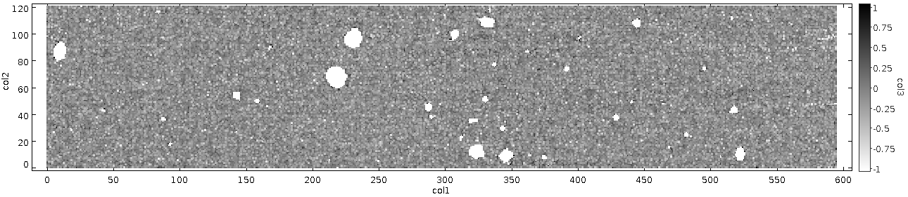
Flat as a pancake ! The structures in the original data set have nothing to do with sensitivity at all, but systematic effects. The noise appears worse only because pixel intensity is spatially correlated, not because there's any greater overall variation in the flux values.
What I like about this is that it shows the important lesson of data visualisation from the datasaurus used in anger, but also that visualising the data can itself be deceptive. Visualisation lets you see at a glance structures that would be ferociously difficult to quantify. At the same time, when it comes to estimating statistical properties, your eye can be misleading : you can't see the standard deviation of an image just by looking at it. Some information you just can't get except through quantitative measurement. Trust the numbers, but remember that they don't tell you everything.
Very cool stuff!
ReplyDeleteI have correllated noise in some of my satrophotos. I should try this.
ReplyDelete